Saturday, March 16, 2013

I'm getting better at this...LOL

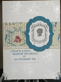
Now it's only been three months between blogs!  Here are a couple of new cards I've created so you can see the differences in using a variety of mediums.  I love how simple you can be and how creative you can be.  I'm sorry that my blog is having issues in being able to accept comments.  I'm still working on that!  Stay tuned, hopefully we'll have that fixed shortly as I really want to get your feedback!
This was a card I made as a birthday card.  It really turned out well.  I put vellum paper over the silhouette behind and then embossed Happy Birthday on it.  Our recipient loved it :)


This is one I made for a bridal shower.  The floral pattern in the background is stamped with illuminate stamps...it's adorable.  There are pearls around the girl's neck.  Soooo cute!!!


You can see the pearls much better here...and on the inside,
the remainder of the caption reads...LOVE gives us a Fairytale.


Wednesday, January 2, 2013

Another Card

Happy New Year!!!

I have another card to share with you today.  I made it to thank someone for their kindness over the holidays.  Yes, I know it's purple...and I do use other colours...lol

I hope you like it :)


January is Alzheimer's awareness month.  Please remember to help those who can't help themselves... https://www.facebook.com/?ref=tn_tnmn#!/AlzheimerSociety

Saturday, December 29, 2012

At long last...another post

Are you looking for more of what I do??? 

Here are some items I've made recently...I hope you like them!

This is the front of an adorable card that lets someone know you're thinking of them!!!
And here is the inside...so thoughtful!
This is one of four Welcome/Home Sweet Home "signs"
 I made for my sons for Christmas.  Each one mirrors a part of their personal lives.
  This one shows two dogs.  While not an exact image, each dog is a representation of my son and daughter-in-law's beautiful dogs.
This one needed a masculine touch, so there are no flowers or butterflies.
I couldn't use "Welcome" for this one because the recipient's last name starts with "W," so I used Home Sweet Home instead.  The background has a child swinging on a swing hanging from a large tree.
This one incorporates the colours the kids have in their home.  So, as you see, it's mostly blacks, greys and white.  Their home is stunning with the contrasts.  Again, I had to use the Home Sweet Home because the recipients' surname starts with "W." 
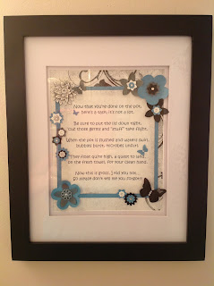
This one, I made for my "powder room." 
So many times, guests forget to put the lid down on the toilet,
 so rather than be "rude"
and continually ask, I thought I'd try putting up a cute little sign. 
Turns out, it's a great reminder, and it works well.  :)


I saw this saying on Facebook and thought it would be appropriate
 as a card-front for my parents' niche at the columbarium. 
While they're both gone now, I still want to acknowledge them during the holidays. 
I also made one slightly different for my grandparents' niche.
This is an adorable, little card I made for my niece!
Her favourite colour is orange, followed by yellow!
While not traditional colours for Christmas,
I think the card turned out rather well. 
It's kinda cute :)
And this is a cute, little card for another niece.
Her favourite colour is purple, but I'll bet you
guessed that...lol
Again, not a very traditional colour for Christmas,
but I think with the silver, it worked quite well.

Monday, May 28, 2012

Getting Close to Completion :)

Thanks for stopping in today!  I have a few more photos of my son's wedding scrapbook, and then I'll show you some of the beautiful cards I've been working on...then we'll get back to scrapbooking!  I sure hope you're loving both.  Oh, there's also the family/name frames...they're so cool!!!  And they can be done in any colour...to fit any decor...well, THAT was quite the tease, wasn't it...LOL

Anyway, back to the wedding scrapbook...

I kept the same colour scheme throughout because those were the colours our beautiful bride chose for her colour scheme.  I was fortunate enough to be able to incorporate a variety of patterns as well...keeping all the colours the same.

This shows some background stamping as well as a variety of patterened paper and punched flowers.
Here, I used the same ideas as before but with the varied paper patterns and different punches.


In this series of pages, I used a bit of ribbon and fabric.  The Mr. & Mrs. ribbon came from the couple's gift boxes.  This way, I get to keep so many parts of their big day!

A closer image of the page.
Here, you can see the ribbon used, as well as some "bling."


On this page, I stamped the background, added some bling and some punched flowers.  Sometimes, I find simple is better.
Of course, a closer look at the flowers and stamped background.

Friday, May 25, 2012

New Pages

I have some more pages to show you from my son & daughter-in-law's scrapbook.  So far, I'm hoping you like what you've seen.  I just love creating these pages...
If you'd like to learn how to create your own memories, I'm happy to show you how...just ask :)

I love the way this turned out...the four photos on the right are perfect together!
AND, I used the negative image from the swirl on the left-hand page to compliment
that side of the series of photos.  I love it!

Here is a closer view of the right-hand page.  The photographer was
a photo journalist and her photos are just stunning.


The "banners" say "Kids at Heart"
Which is exactly what this series of photographs reminds me of.
I absolutely adore these photographs and how fun they are.
So Sweet
Isn't this adorable???


Sunday, May 20, 2012

More Goodies :)

Good morning!!!

This is the cover - it shows one of their engagement photos
 
I have a few more goodies to show you today.  I made a wedding album for myself with photos from my son's wedding.  I'm so happy with the way it turned out.  I'll share a few pages each day.  I like to put plenty of 3-dimensional embellishments when I can.  Notice on page two there are 3-dimensional daisies.  My daughter-in-law had beautiful daisies as accents, so I incorporated them into my album in several colours.  I hope you like pages so far...


This is page one - I have no particular order in my album

A closer view of page two

Second page - again, no particular order


Friday, May 18, 2012

A Few Examples

A Sympathy Card
This can be adjusted to anything from Sympathy to Birthday to Thank You
Child's Birthday - or for the child in all of us
Child's Birthday - The Ice Cream opens to insert money

Birthday to Thinking of You...Anything
My Family Frame - It can be adjusted to nearly any word you wish!  From your surname to a child's name to an inspirational phrase - WISDOM, INSPIRE, LOVE, MOTHER - You choose...


Here are a few creations you can use as examples to determine whether you like my work or not.  I can recreate these to suit your tastes.  Stampin' Up! www.stampinup.com has a fantastic variety of colours available to match every colour scheme.